As a beta junkie, I felt compelled to install the latest OS for my iPad and new iPhone. This is a few days in. First impressions are important. Here are quick first week thoughts.
Liquid Glass
Obviously, this is the most noticeable change. I feel mixed about it. It is very different depending on what you put in the background. If you have a bright background, the icons look extremely harsh.
Interestingly, there are not a ton of screenshots of what it looks like in the wild on google image search. Here is a screenshot from my own iPad.

I find the glass effect with light backgrounds very problematic. It has the same problem with the iPhone.
There are definitely places where it looks slick. The hover effect is usually blocked by my finger, but you can still see it a little on the sides. I wonder if they are going to change any of the details. I may get used to it, but now my grade is “Mid”.
One suggestion would be to put a black background pill behind the letters of the groups.
Virtual Keyboard
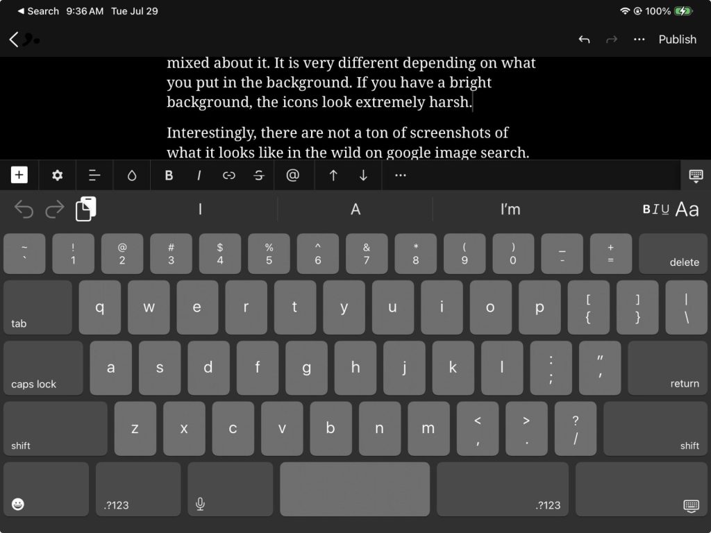
One of the most annoying changes is the layout of the keyboard. Here is a screenshot as I was typing this post on the iPad. It is about 20% taller than previous. Additionally, he space bar has become ridiculously small. I am pressing the number button when I mean the space bar constantly. It’s downright infuriating. The spacebar is a huge miss. The height is also obscuring the choices in almost every scenario.
My suggestion to be to make the keyboard have a separator that is draggable. So I can shrink and expand it as I need. Sometimes I want it really small and sometimes bigger is fine.
Example use case: I invite my work address into a doctors appointment on my Gmail calendar. Typing my name and seeing the choice to select is impossible because it’s covered up.
Wallpaper
This is a dumb thing to focus on, but they actually did a nice job with it. You choose a photo and it automatically figures out where the people are and then let’s the clock go behind someone’s head. It’s very clever and looks great.
They have another feature to make the picture animate a little, but it seems to work only some of the time. I can’t figure out why.
Camera
The camera app is probably the one place they really focused on usability with the Liquid Glass effects. They organized the options better and made the UI less cluttered. Simple things are simple.
I am not a photo wizard and most of the options are beyond me. I don’t even know what a HEIC file is. There are so many options, I honestly have no idea what the right answer is for most of them.
Summary
Of course, I am going to keep using the beta. There are other features worth exploring, but these are the ones that jump out to me in the first week of use. It feels like an ambitious change and will certainly maintain Apple as a trend setter. Lets see how it plays out.
Whatya think?