What is the greatest user interface ever conceived? In my opinion, it is the spreadsheet. Yes, there are plenty of great interfaces, but this is my favorite. Specifically, what is amazing is the leap of faith the designer made to create this incredible UI.
First a bit of history.
Dan Bricklin conceived VisiCalc while watching a presentation at Harvard Business School. The professor was creating a financial model on a blackboard that was ruled with vertical and horizontal lines (resembling accounting paper) to create a table, and he wrote formulas and data into the cells. When the professor found an error or wanted to change a parameter, he had to erase and rewrite several sequential entries in the table. Bricklin realized that he could replicate the process on a computer using an “electronic spreadsheet” to view results of underlying formulae.
Wikipedia
I want you to imagine a world where this never happened. Where Dan never designed the digital spreadsheet. There is no Excel. There is no Google Sheets. It doesn’t exist.
And then a designer comes to you and says, “I have an idea! It’s a new user interface that people could use for all sorts of things. The screen is 95% rectangles with a formula bar at the top. The formulas work on different cells!”
Some people would look at that person and say, “You are out of your mind. No one will understand this thing. It’s way too hard and complicated! You suck as a designer!
Honestly, it’s a crazy design. However, it is one of the most loved user interfaces ever built. How can this be? How can something so obviously wacky be loved by so many? If it is loved by so many, why aren’t there more wacky interfaces? Why aren’t there more applications that look and act like a spreadsheet?
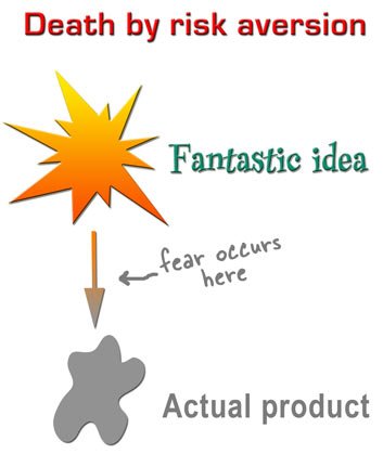
Designers come up with wacky design ideas all the time and usually those ideas are thrown away. There is a wonderful page by Kathy Sierra that illustrates why so many great things become shitty. This one comes to mind.

Side note: What happened to Kathy Sierra is terrifying and awful. It makes me worry about all of humanity. She is a brilliant designer and thought leader. The world is worse when her voice is silent. Buy her book.
Anyway, the point is that the spreadsheet would scare most product managers and confuse most decision makers. It took a leap of imagination to conceive of this new way of working.
When I am designing, I try to channel that innovative thinking and conceptualize different and wacky ways to do something. Then I squint my eyes and see if it can be made.
The spreadsheet is a miracle of user interface design. If you are a designer, you should study it and understand why it is so good. It’s fast, flexible, and responsive to user input. How can make your own products and designs be that good? Are you even trying?
Last thought: Some topics that should be taught in-depth in College HCI Programs…
- User Interface Hall of Fame
- Desktop vs Mobile Design Patterns
- How to Communicate with Engineers and Product Managers
- How to Write Emails
- Leadership in the Work Environment
- Work 101 (How to show up and do work)
That will be a blog post for another day.
Whatya think?